
Making Neutrals Sing
By adding just one note.
“Small areas of rich color can make the whole painting look colorful.”
-Matt Smith
Colour can be deceiving. We may be attracted by the bright shiny light in a landscape. It’s often the most exciting element. But it’s the duller colours that hold the scene together.
Landscapes are full of muted, neutral colours. So when we paint we need to pay attention to all these grayed colours. They often have the biggest impact.
Bright, full chroma colours can be desaturated by mixing them with their complementary colour or with black, white or earth tones. This greys down the colour making for a more restful, quiet image.
But then we need to make those colours sing. By adding just one warm, slightly more saturated colour, as Matt Smith suggests above, we can make the whole painting look colourful.
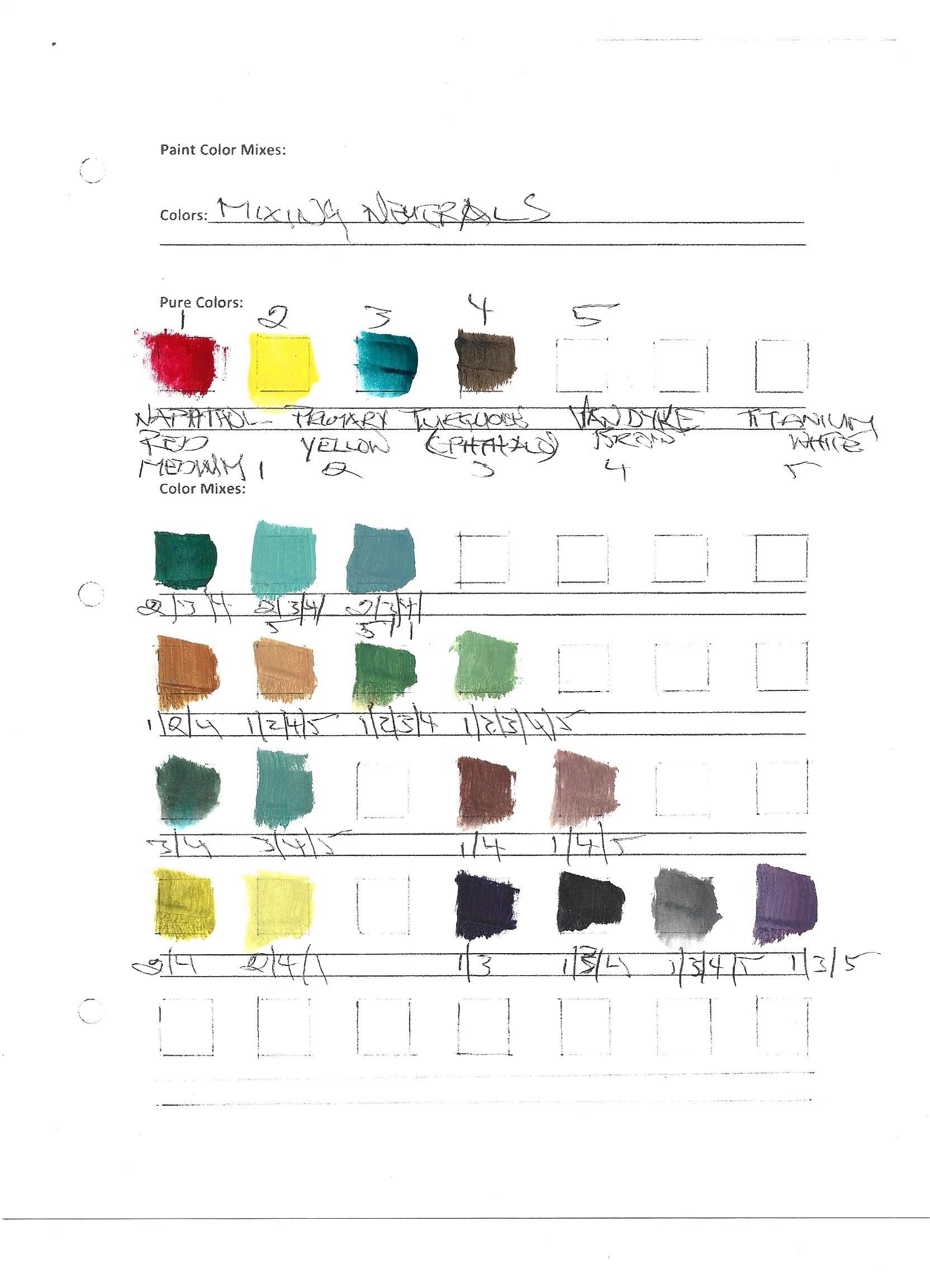
For the three paintings in this post, I used a limited palette of Napthol Red Medium, Primary Yellow, Turquoise (Phtho), Van Dyke Brown and Titanium White. And I mixed those colours to neutral. The same palette was used for all three paintings. The chart above shows some of the various neutral mixes possible from the five colours I selected. And those mixes became a good starting point for the paintings.
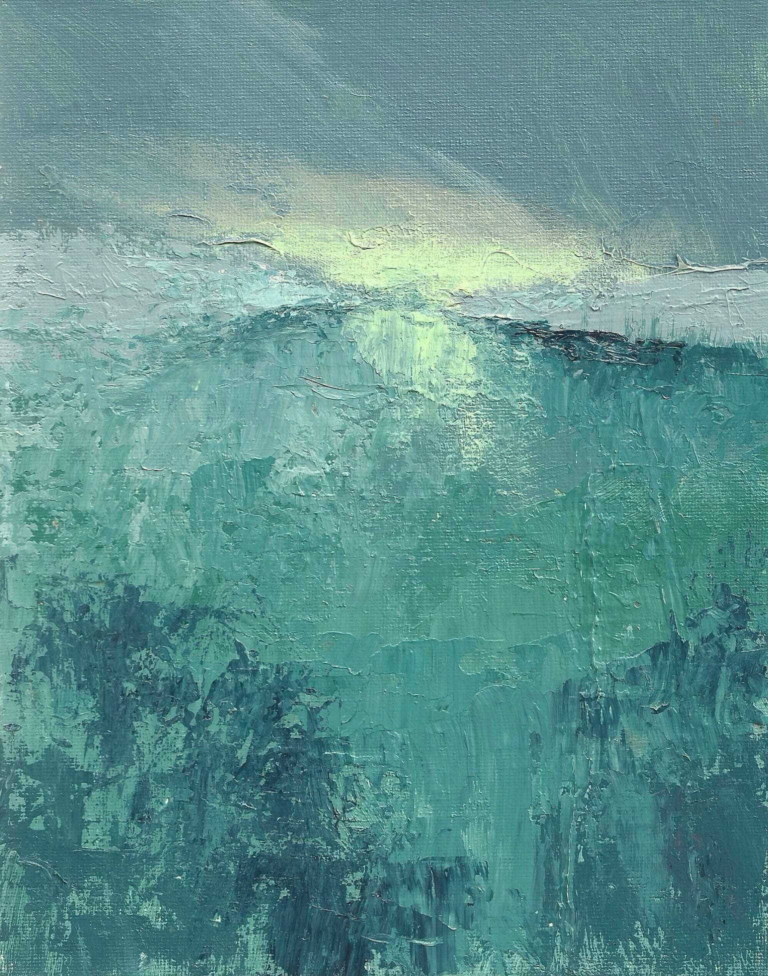
The painting at the top of this post shows how just one bright, warm colour can have a strong impact on the overall landscape, and on the viewer’s interpretation of the landscape. I used a neutral colour as the highlight (bottom row of colour chart) but the warmth of that colour makes all the other colours come alive.
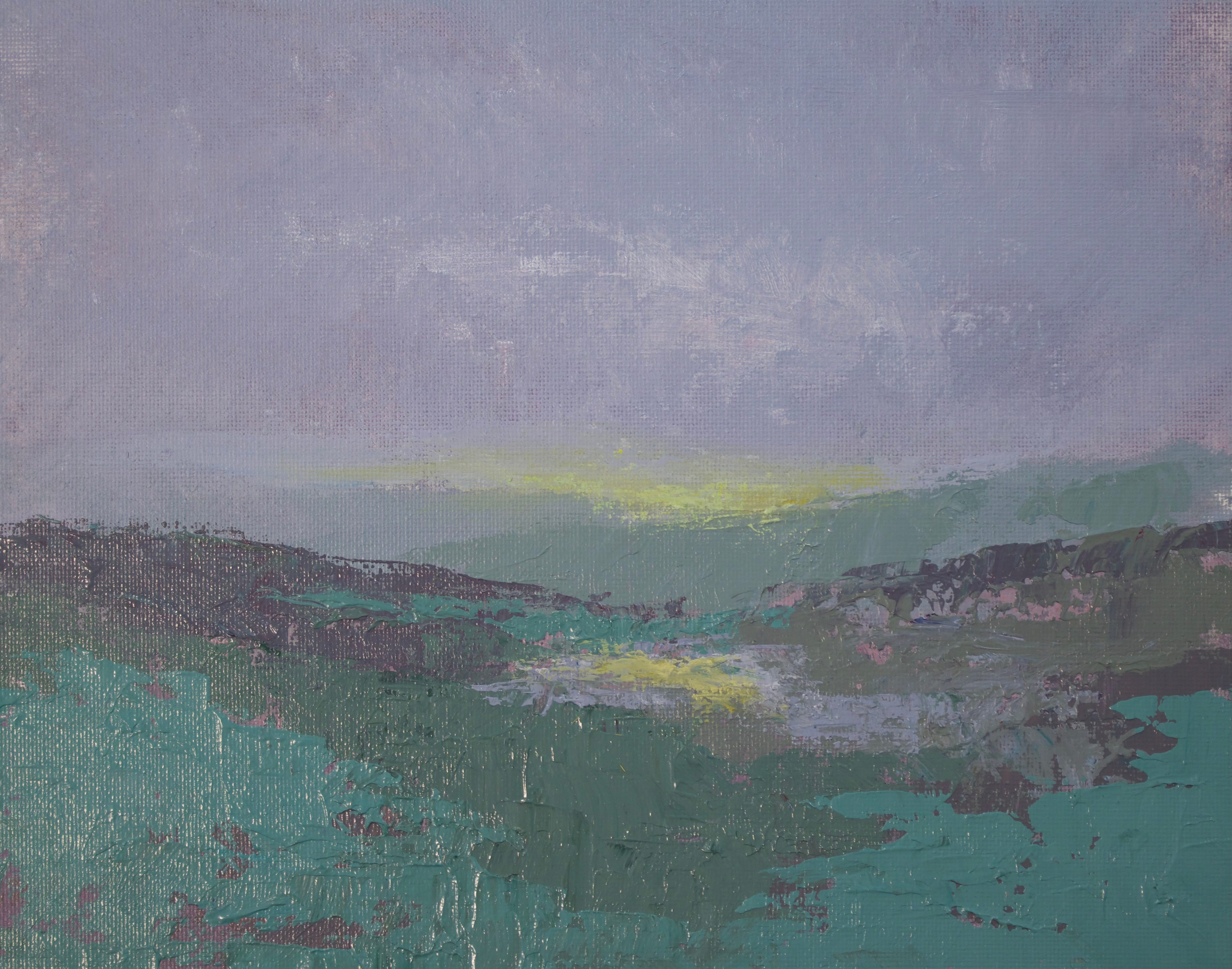
I used the same warm highlight on this painting but the image itself was duller and foggier so I toned down the yellow with a bit of brown so it didn’t overwhelm the murkier scene.
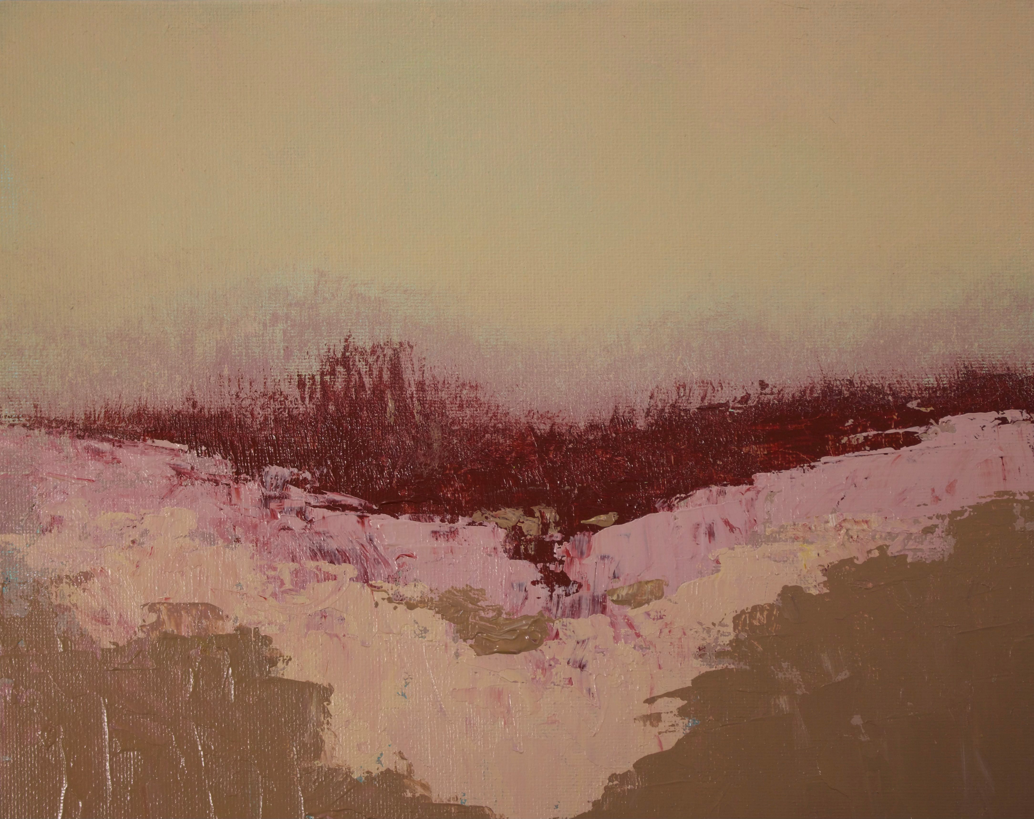
And finally, the painting below takes a different turn. Since the entire painting is warm and light, but still painted with greyed, neutral tones, I decided to make the impact colour darker, still neutral but full of rich red strengthening the warmth of the entire painting.
Try looking for the neutrals in nature and in art and see how they impact your interpretation of the scene. And for more subtle colour work, check out the paintings of Andrew Wyeth and contemporary artist Charlie Hunter.
Again, many thanks for reading.
Cheers
Bob
Love the 1st painting, Bob! Thanks for sharing!💙🩵🤍